2021 – 2022 · Role: Design Lead and 3D asset creator · US student-health platform serving multicultural college populations · Team: Kiira Health product team · Scope: Research, the illustration-led enrolment flow and the 3D asset set
Context
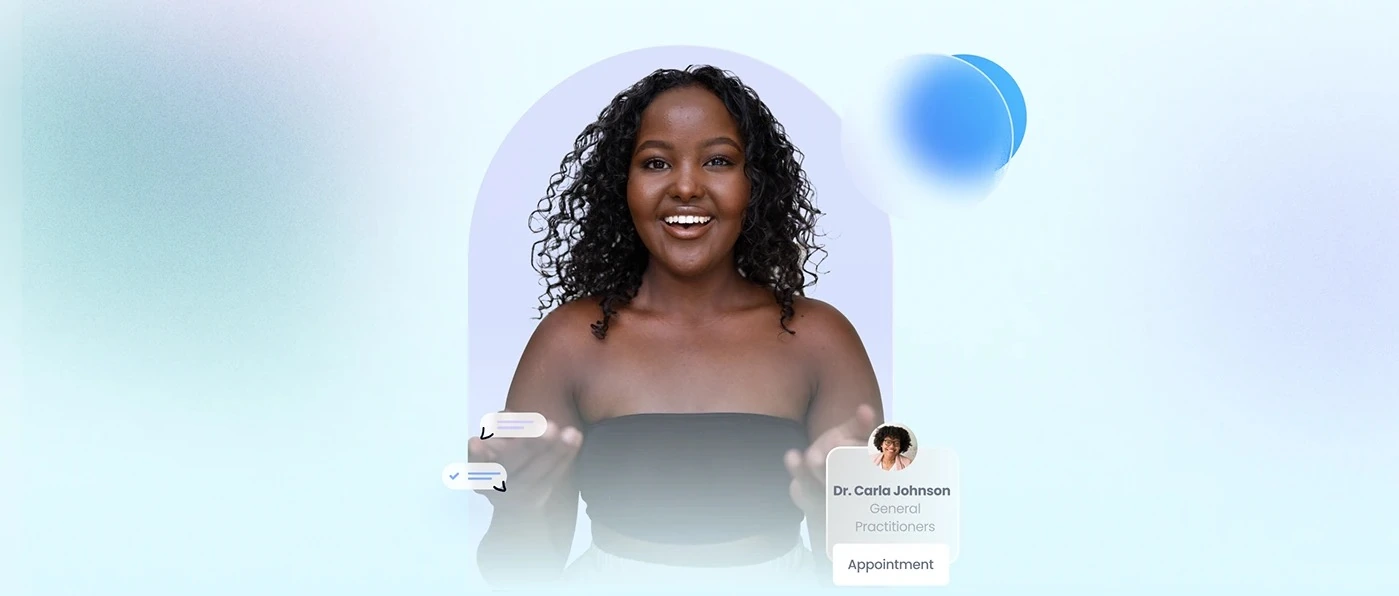
Kiira is a Los Angeles-based virtual health clinic for the wellbeing of young women and gender-diverse students. I led the redesign of its web platform around a multicultural student population.
Challenge
Healthcare is intimidating, especially for students approaching reproductive or mental health for the first time.
The clinical coldness: the original site felt like a standard medical directory, with none of the warmth a younger audience expects.
Navigation friction: insurance, pricing and provider bios needed organising so students could find care easily.
The trust gap: how do you make a virtual clinic feel as safe and personal as a face-to-face visit?
Discovery
I ran 12 student interviews on care-seeking behaviour. The insights pointed away from the clinical, form-heavy enrolment students were bouncing off.
I realised a clinical interface alone wouldn’t close the trust gap. We needed a friendly anchor, so I created Kiira the Penguin, a custom 3D mascot who guides people through stressful tasks like insurance verification and symptom checking with playfulness and care.
Approach
Custom 3D over flat icons — The 3D assets are not decoration: they act as calls to action on cards and as welcoming avatars.
A palette that balances authority and warmth — After trying several, we landed on Kiira Blue (#3F84FF) and Kiira Dark (#000B1E) to balance medical authority with a modern tech feel.
Craft
A softer enrolment flow — A softer, illustration-led enrolment flow replaced the previous clinical form, with Kiira's mascot and 3D assets carrying the tone.
A simpler way in — A tailored-healthcare landing page and service selection that lets students step in easily.
Previews without losing your place — Preview cards and pop-up screens show provider availability and bios without leaving the flow.
A 3D icon for every category — Each key health category, from primary care to mental health, has a unique 3D icon I built.
Impact
5× — Product engagement
−65% — Onboarding bounce
2,000+ — Students served
12 — Student interviews
Reflection
When you design for a high-anxiety sector like health, the visual vibe is as functional as the navigation. Don’t be afraid to bring non-standard elements like a 3D mascot into professional spaces: sometimes a friendly penguin is exactly what helps someone finish a daunting medical form.
Tools
Figma
User interviews
Illustration
3D assets
How it came together
From a clinical form to a gentler way in
Talked to students — 12 interviews about how they look for care.
Saw where they dropped off — Many left at the clinical, form-heavy sign-up.
Replaced the form — A gentler, illustration-led flow, with the mascot and 3D assets setting the tone.
Checked it worked — Engagement went up 5× and onboarding drop-off fell 65%.
I’m , a Senior Product Designer and Design Engineer. Ten years across fintech, healthtech, commerce and logistics, from user research to production code.
I studied graphic design, led a product design team at Alerzo, and now design and build private capital software at DealStack.
My best ideas come from where products are actually used: market stalls in Lagos and Ibadan, a fund administrator’s spreadsheets, a bank’s support queue. I turn what I find there into clear, calm systems.
Then I help build them. At DealStack I coded about 90% of our design system in React, so what ships is what was designed.
User research
Interviews, field studies, usability and tree testing. I learn from what people do, not only what they say, and turn it into product decisions.
User interviews · Usability testing · Field research · Journey mapping · Analytics
Product design and systems
End-to-end product design for complex B2B and fintech software: clear flows, sound information architecture and design systems that scale.
Interaction design · Information architecture · Design systems · Prototyping · Accessibility (WCAG 2.1)
Design engineering
I prototype and build in React and TypeScript, so designs are tested against real data and what ships matches what was designed.
Recommendations from my LinkedIn profile, from a manager, a fellow designer and the marketers I’ve shipped with.
“Ayodeji’s commitment to excellence is evident in every project he undertakes. He consistently delivers high-quality designs that exceed expectations, making him an invaluable team member.”
“Working alongside Ayo was truly inspiring. His leadership in product design, coupled with his ability to bridge design and engineering, elevates the entire team’s output.”
AAAbdul-Lateef AkinyemiSenior Product Designer
“Ayodeji is an exceptional team player who brings creativity and strategic thinking to every collaboration. His ability to translate complex problems into elegant solutions is remarkable.”
“Ayo is a creative mind who consistently pushes boundaries. His design work is not just visually stunning but strategically sound, always keeping the end user in focus.”
POPromise OsigweMarketing Communications
Beyond the day job.
Mentoring, speaking, and a few companies and products of my own.
Speaking
Tech Rise Africa, to 1,000 people. DSGN Discussions, to 400+. On design leadership, product systems and creative practice.
Companies I’ve founded, and products I build in my own time.
Empocreat (The EOC) builds digital products, brands and experiences with clarity and purpose. I founded it in 2016 and have directed creative strategy for 20+ brand and product projects across fintech, education, consumer tech and e-commerce.
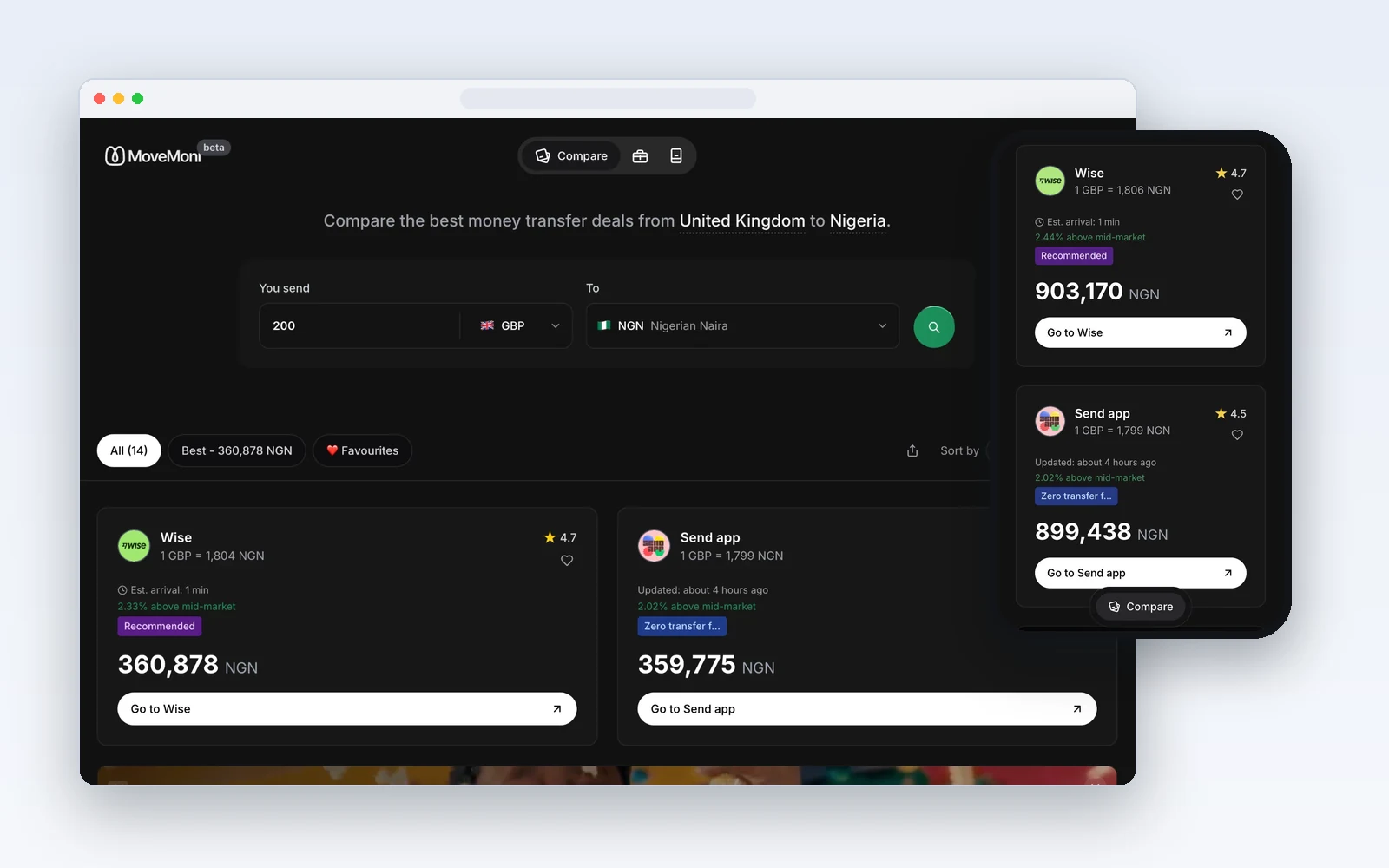
MoveMoni compares exchange rates and fees across international money-transfer providers in real time, so people can see who is cheapest for their route before they send. Users save 3–5% on average on international transfers.
Clariti is a personal finance companion that helps people track spending, budget smarter and take control of their money in one simple app. It started inside MoveMoni and now stands on its own.
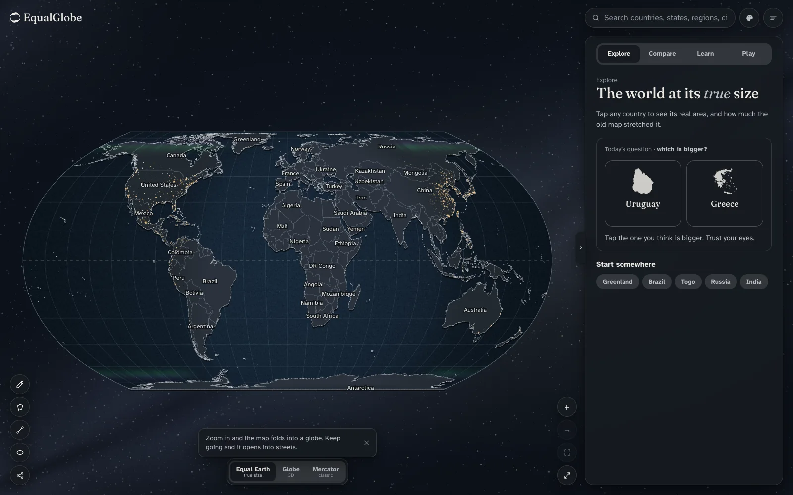
A free, educational world map built on the Equal Earth projection. It folds into a globe, shows what Mercator distorts, and lets you compare countries at their real size. Made for classrooms first, after the UN General Assembly voted in September 2026 to encourage equal-area maps.
Cleap turns a product’s code, database, infrastructure and integrations into one live, zoomable map, so people who build products without reading code can still see how everything fits together.
An open benchmark for one question: given a piece of code, how good is a plain-English description of it? Labels are scored on accuracy, specificity and whether someone who can’t read code would actually understand them. It grew out of Cleap and is at the scaffold stage: a seed set of samples and the scoring pipeline, with real model runs still to come.