A free map that shows the world at its true size, made the week the UN voted to move on from Mercator.
Sep 2026 – now · Role: Founder, designer and builder · Own product · Team: Solo · Scope: The whole thing: the idea, the design, the build and the launch
Context
For more than 450 years, most of us have looked at the world through Mercator’s map, where Greenland looks as big as Africa. On 4 September 2026 the UN General Assembly voted 164 to 1 to encourage equal-area maps instead.
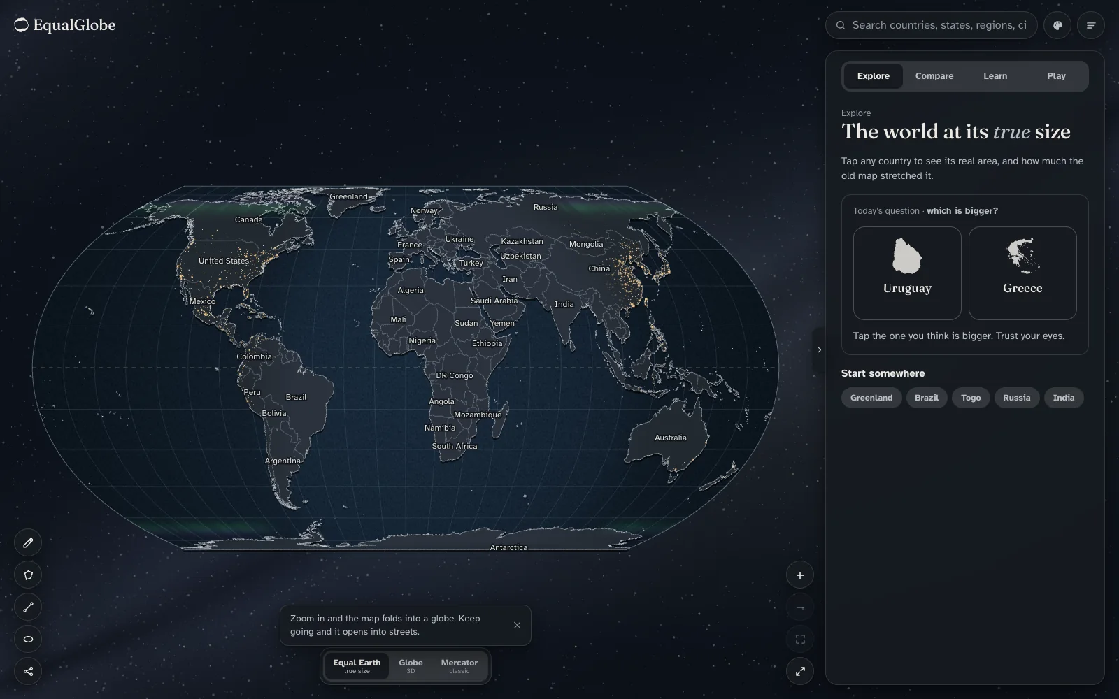
I wanted that vote to be something a person could feel, not just read about. So I made EqualGlobe: a free map for everyone, with no account, no ads and no tracking. Tap any country and see how big it really is. It’s made for classrooms first, and for anyone curious second.
Challenge
Make the accurate map feel as easy and as satisfying as the familiar, wrong one, without asking anyone to sit through a lesson first.
Objectives
Put true area first: tap a country and see its real size and how far Mercator stretched it
Let people compare countries by dragging them anywhere on the map, where their area never changes
Teach the history and the maths of projections without a lecture
Work on a phone, a school Chromebook and a projector
Cost almost nothing to run, with no accounts and no tracking
Discovery
I started with the resolution, then looked at what already existed. Plenty of tools let you drag one country over another. None of them fold a flat map into a globe and then into streets, and none of them teach anything. The map on most phones is still Mercator. That gap became the plan: explore, compare, learn and play.
Approach
One map that changes shape — Zoom in on the flat map and it folds into a globe, centred on the spot you touched. Keep going and it opens into streets. Zoom out and it all unwinds. The projection stops being a setting and becomes something you do with your fingers.
Make the number mean something — Tap a country and you get its real area, its rank and how much the old map stretched it, in plain words. Greenland is drawn 11.8 times too big, as if it were 25.45 million km², which is most of Africa.
Compare by dragging — Drag up to six countries, or a union like the EU, onto each other at true scale. A faint Mercator ghost shows what the old map would have drawn. You can share what you find as a card, a link or a PDF.
Learn in context — Seven short chapters, from Mercator’s 1569 chart to the 2026 vote. Each one moves the map for you: it highlights countries, adds distortion circles or switches projection. There’s narration, and the whole app works in English and French.
Play, to bring people back — A daily “which is bigger?” question with a streak, so a one-off visit can turn into a habit.
Honest by default — Land is always filled in, because area is the whole argument. Disputed territories are drawn dashed and labelled. The data comes from Natural Earth and OpenStreetMap, and is credited on a Sources page.
Craft
A calm interface — Frosted surfaces over the map, sentence-case labels and real content in every resting state: today’s question, country silhouettes and starter chips. Desktop has a tab bar and a side panel; mobile has a bottom sheet with a grabber and 44px touch targets.
Built for school hardware — The whole world is a single file of about 640 KB, projection maths runs on the GPU, and reduced-motion is respected everywhere. Teacher accounts with anonymous student seats are planned, with no student personal data.
Tools beyond the map — Measure a distance, draw a shape to get its area, show distortion circles, watch live earthquakes from USGS, see a country’s real local time, switch to a satellite skin with NASA night lights, and export a wallpaper.
Result
Live at equalglobe.com: free, in English and French, with seven learning chapters, a daily game and sharing built in. Anyone with a phone or a school Chromebook can open it and see the world at its true size.
Impact
164–1 — UN vote that sparked it, 4 September 2026
11.8× — How much Mercator inflates Greenland
242 — Countries and territories shown at true area
24 days — From first commit to a live product
Learnings
Make the claim tangible — People do not feel 2.15 million km². They feel “most of Africa”.
Constraints are the product — No metered map APIs, no accounts and no tracking kept it free to run and safe for classrooms.
Zoom is the interface — Folding flat into globe into streets turned the projection into something to play with, not a setting to find.
Reflection
A map is a quiet argument about how big things are. I wanted this one to make its argument in the open, for free, to anyone who opens it.
Tools
React
TypeScript
WebGL2
MapLibre GL JS
Natural Earth
OpenStreetMap
How it came together
One map, three views
Equal Earth — Flat, with every country at its true area.
Globe — Zoom in and it folds, centred where you pointed.
Streets — Keep going and it hands off to a street map.
Four ways in
Explore — Tap any country to see its real size.
Compare — Drag countries onto each other at true scale.
Learn — Seven short chapters that move the map for you.
I’m , a Senior Product Designer and Design Engineer. Ten years across fintech, healthtech, commerce and logistics, from user research to production code.
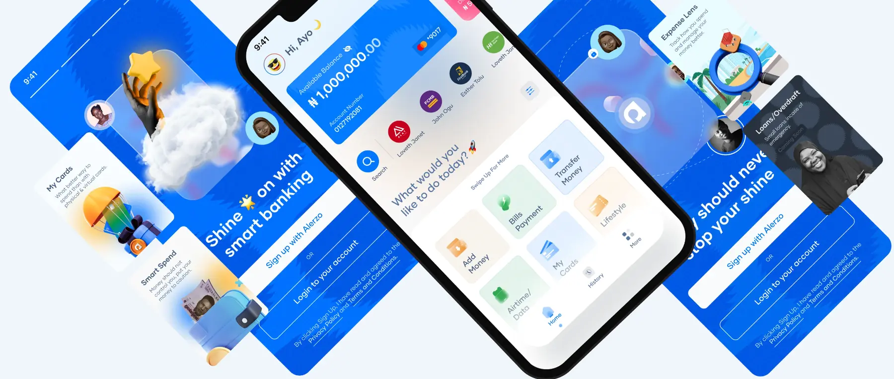
I studied graphic design, led a product design team at Alerzo, and now design and build private capital software at DealStack.
My best ideas come from where products are actually used: market stalls in Lagos and Ibadan, a fund administrator’s spreadsheets, a bank’s support queue. I turn what I find there into clear, calm systems.
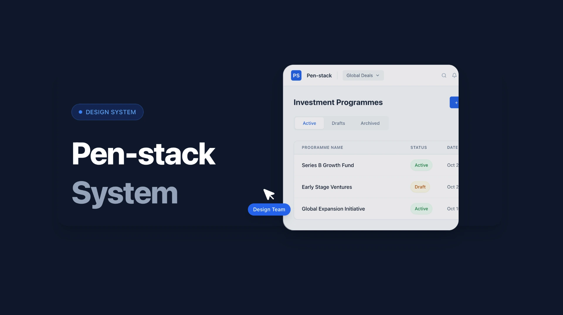
Then I help build them. At DealStack I coded about 90% of our design system in React, so what ships is what was designed.
User research
Interviews, field studies, usability and tree testing. I learn from what people do, not only what they say, and turn it into product decisions.
User interviews · Usability testing · Field research · Journey mapping · Analytics
Product design and systems
End-to-end product design for complex B2B and fintech software: clear flows, sound information architecture and design systems that scale.
Interaction design · Information architecture · Design systems · Prototyping · Accessibility (WCAG 2.1)
Design engineering
I prototype and build in React and TypeScript, so designs are tested against real data and what ships matches what was designed.
Recommendations from my LinkedIn profile, from a manager, a fellow designer and the marketers I’ve shipped with.
“Ayodeji’s commitment to excellence is evident in every project he undertakes. He consistently delivers high-quality designs that exceed expectations, making him an invaluable team member.”
“Working alongside Ayo was truly inspiring. His leadership in product design, coupled with his ability to bridge design and engineering, elevates the entire team’s output.”
AAAbdul-Lateef AkinyemiSenior Product Designer
“Ayodeji is an exceptional team player who brings creativity and strategic thinking to every collaboration. His ability to translate complex problems into elegant solutions is remarkable.”
“Ayo is a creative mind who consistently pushes boundaries. His design work is not just visually stunning but strategically sound, always keeping the end user in focus.”
POPromise OsigweMarketing Communications
Beyond the day job.
Mentoring, speaking, and a few companies and products of my own.
Speaking
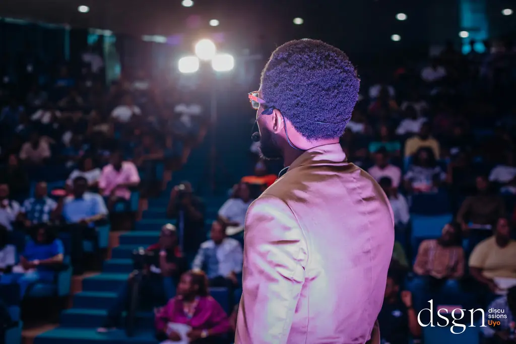
Tech Rise Africa, to 1,000 people. DSGN Discussions, to 400+. On design leadership, product systems and creative practice.
Companies I’ve founded, and products I build in my own time.
Empocreat (The EOC) builds digital products, brands and experiences with clarity and purpose. I founded it in 2016 and have directed creative strategy for 20+ brand and product projects across fintech, education, consumer tech and e-commerce.
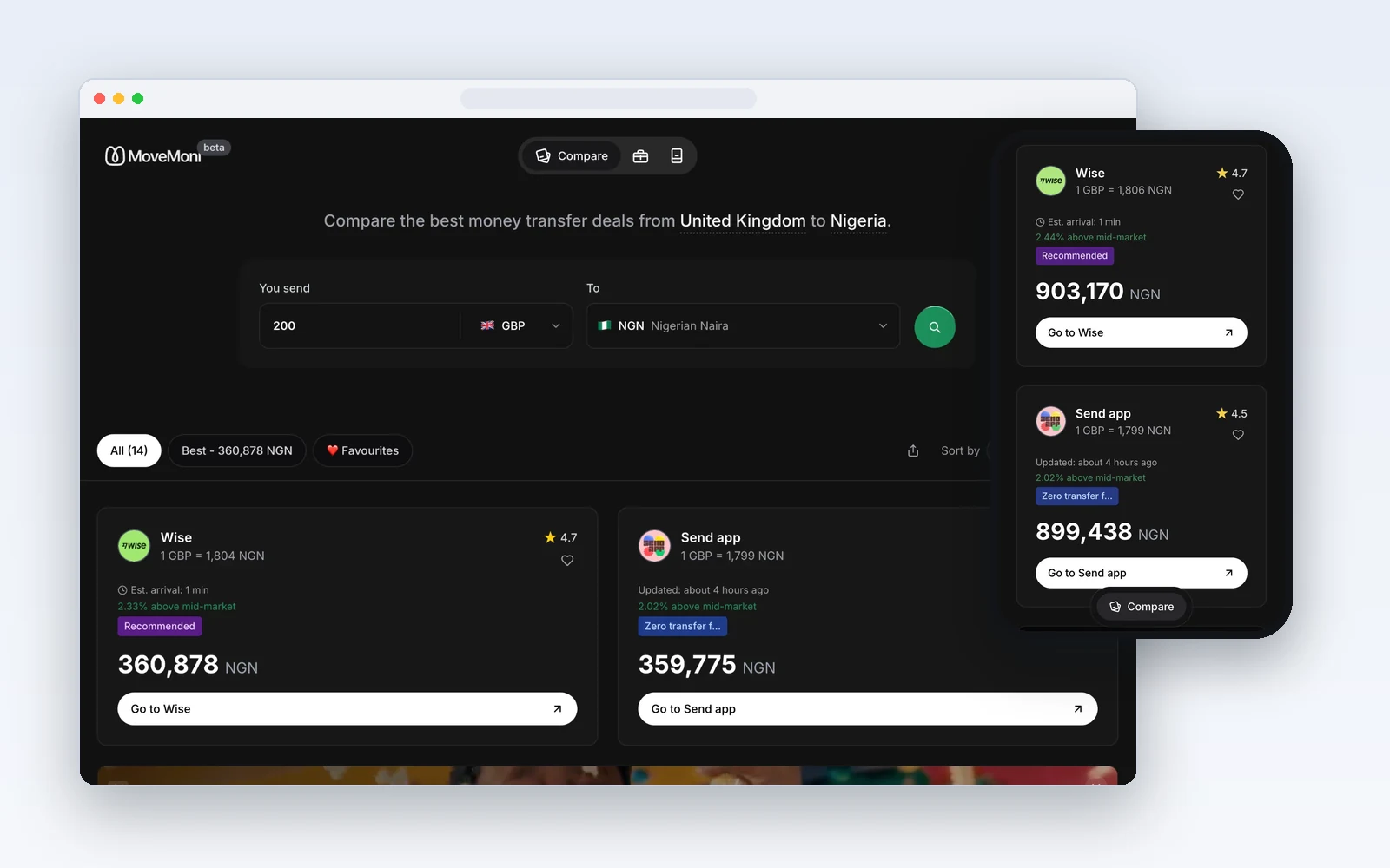
MoveMoni compares exchange rates and fees across international money-transfer providers in real time, so people can see who is cheapest for their route before they send. Users save 3–5% on average on international transfers.
Clariti is a personal finance companion that helps people track spending, budget smarter and take control of their money in one simple app. It started inside MoveMoni and now stands on its own.
A free, educational world map built on the Equal Earth projection. It folds into a globe, shows what Mercator distorts, and lets you compare countries at their real size. Made for classrooms first, after the UN General Assembly voted in September 2026 to encourage equal-area maps.
Cleap turns a product’s code, database, infrastructure and integrations into one live, zoomable map, so people who build products without reading code can still see how everything fits together.
An open benchmark for one question: given a piece of code, how good is a plain-English description of it? Labels are scored on accuracy, specificity and whether someone who can’t read code would actually understand them. It grew out of Cleap and is at the scaffold stage: a seed set of samples and the scoring pipeline, with real model runs still to come.